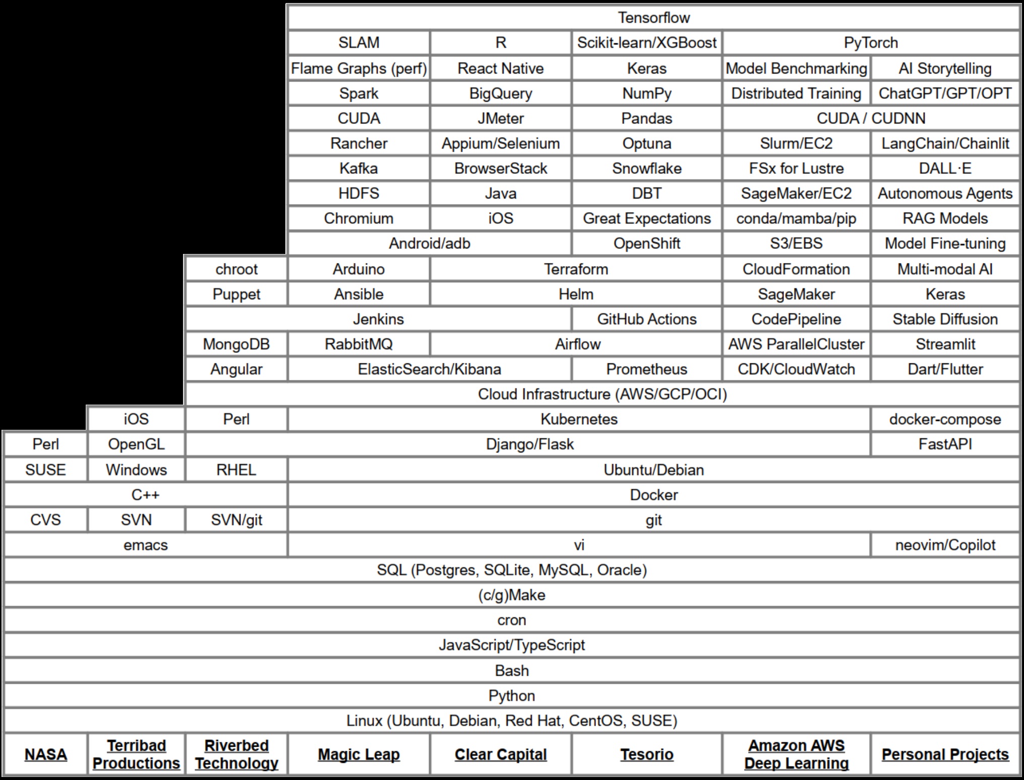
Danny’s Career Flame Graph
While working on the Magic Leap One, one issue was just figuring out what our hardware could really do. At the time, we hadn’t even settled on a final form-factor for our upcoming mixed reality headset that was meant to change the world (or at least maybe replace a few cell phones or TVs). But we knew we’d be using a special version of Nvidia’s Tegra chipset, similar to what was used in the Nintendo switch.
Besides being a bit aghast that our next-generation headset still had to conform to the laws of thermodynamics and include a small spinning fan, it was hard to argue with the graphics power we could get out of these little Nvidia boards. Only a year earlier, we’d started testing mixed reality applications on custom headsets running off of desktops with Nvidia Titan X video cards connected by a bundle of about 12 cables. So achieving even a similar experience with hardware that could fit in (ok maybe on…) your pocket was dang impressive.
That was all well and good if you wanted to run one application at a time, but Magic Leap one was meant to be more than that. We wanted users to be able to run apps concurrently in the foreground and background. Why couldn’t your AI Tamagotchi Dog run around with you while you slay some dragons in your living room? Maybe they could even help! At least that was the dream back then.
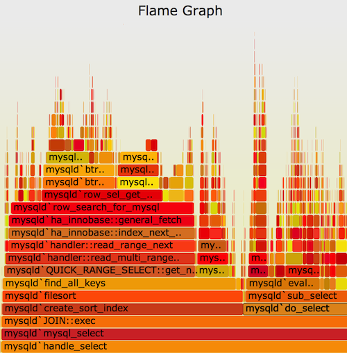
To make the dream a reality though, we had to really understand what our new hardware could do. Luckily, another engineer on my team had spent some time working at Intel with a linux tool called perf. Perf is an awesome profiling tool for linux that allows you to gather information about running processes. This data could then be fed into some special tooling to create flame graphs. “Flame graphs are a visualization of profiled software, allowing the most frequent code-paths to be identified quickly and accurately.” – http://www.brendangregg.com/flamegraphs.html
Those flame graphs turned out to be an amazing tool to really pick apart what’s happening when a piece of software is running, function call by function call. They allowed us to identify what was taking up time and resources and make really great use of the hardware we had. Ever since, I’ve thought that flame graphs could be used for even more though. There are very few other visualizations I’ve run across that can easily communicate that much information in such a small space.
So, I decided to apply the concept to my own career. What would the flame graph of all the skills I’ve accumulated look like? Well, the image above is the end result of that thought experiment. It turns out that the concept maps very well from a program run to a career. The granularity is a bit different, and the meaning of the y-axis is a bit more fuzzy, but the end result is actually a really good snapshot of what I’ve been working on over time. You can see what tools I’ve added to my toolbelt over time, and it’s easily searchable to boot.
So, have a look, let me know what you think! Maybe create your own career flame graph too!